Page 1 of 1
NEW ART / LOGO
Posted: Wed Apr 17, 2024 4:39 am
by OpenXTalkPaul
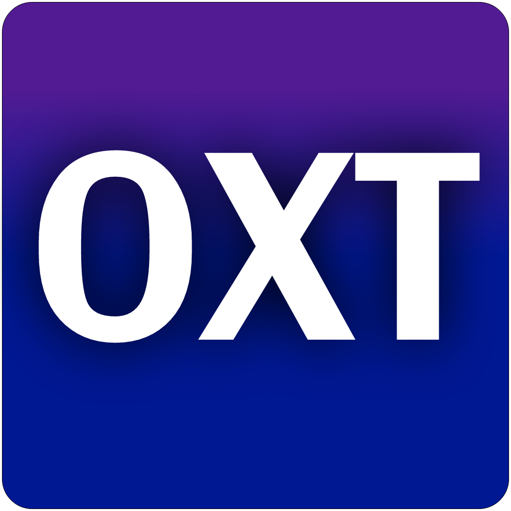
Haven't played around too much with this pretty good image generative AI that I have access to, so I decided to throw it my OXT Icon to see how it could spruce it up for me with the right prompts. I had it generated a bunch of different versions. This is one of the better ones, cleaned up a bit and icon-ized.
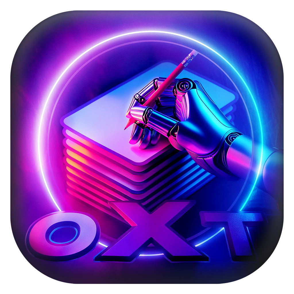
- OXTB2.png (1.22 MiB) Viewed 797 times
Re: NEW ART / LOGO
Posted: Wed Apr 17, 2024 5:36 am
by OpenXTalkPaul
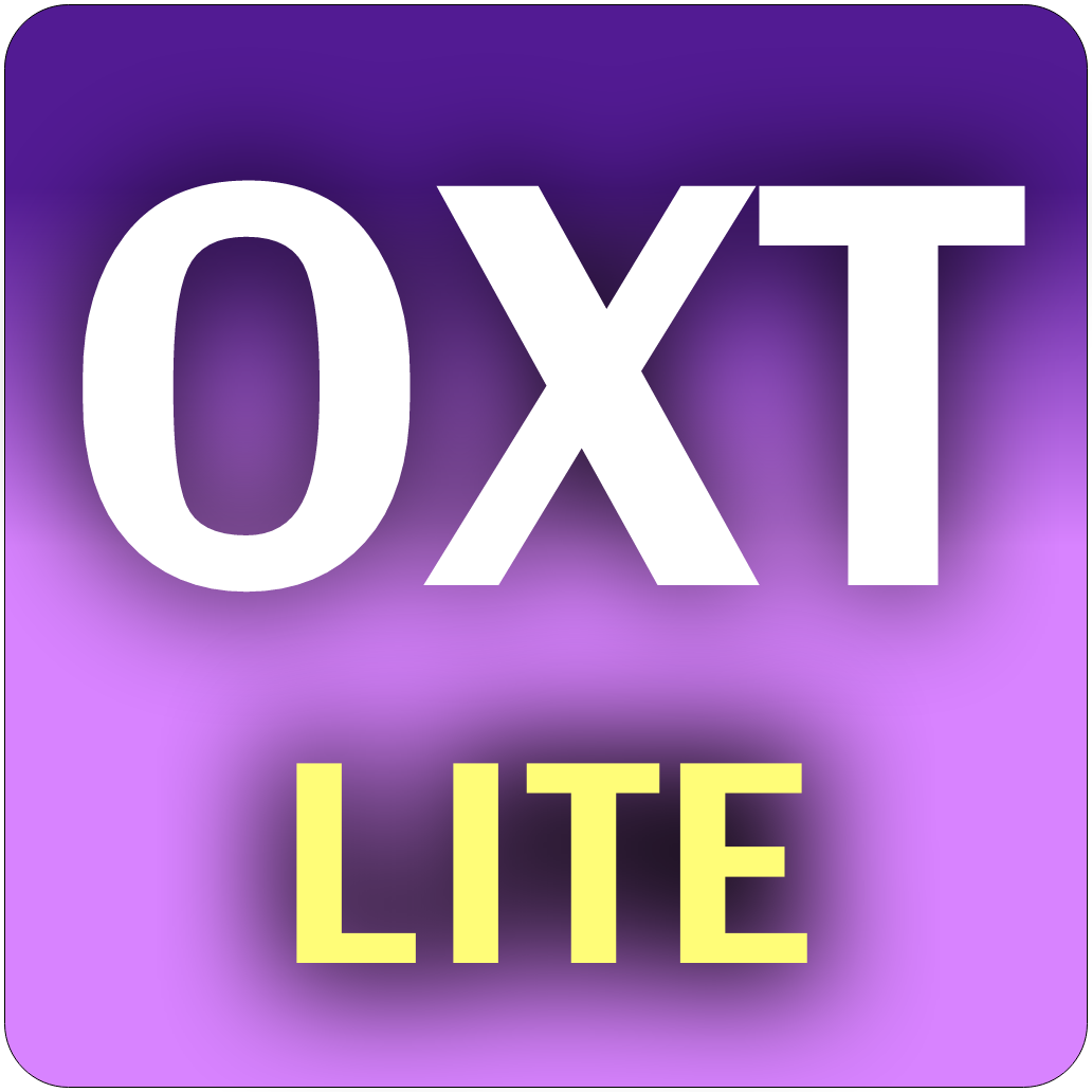
Here's one for a OXT Retro Edition:
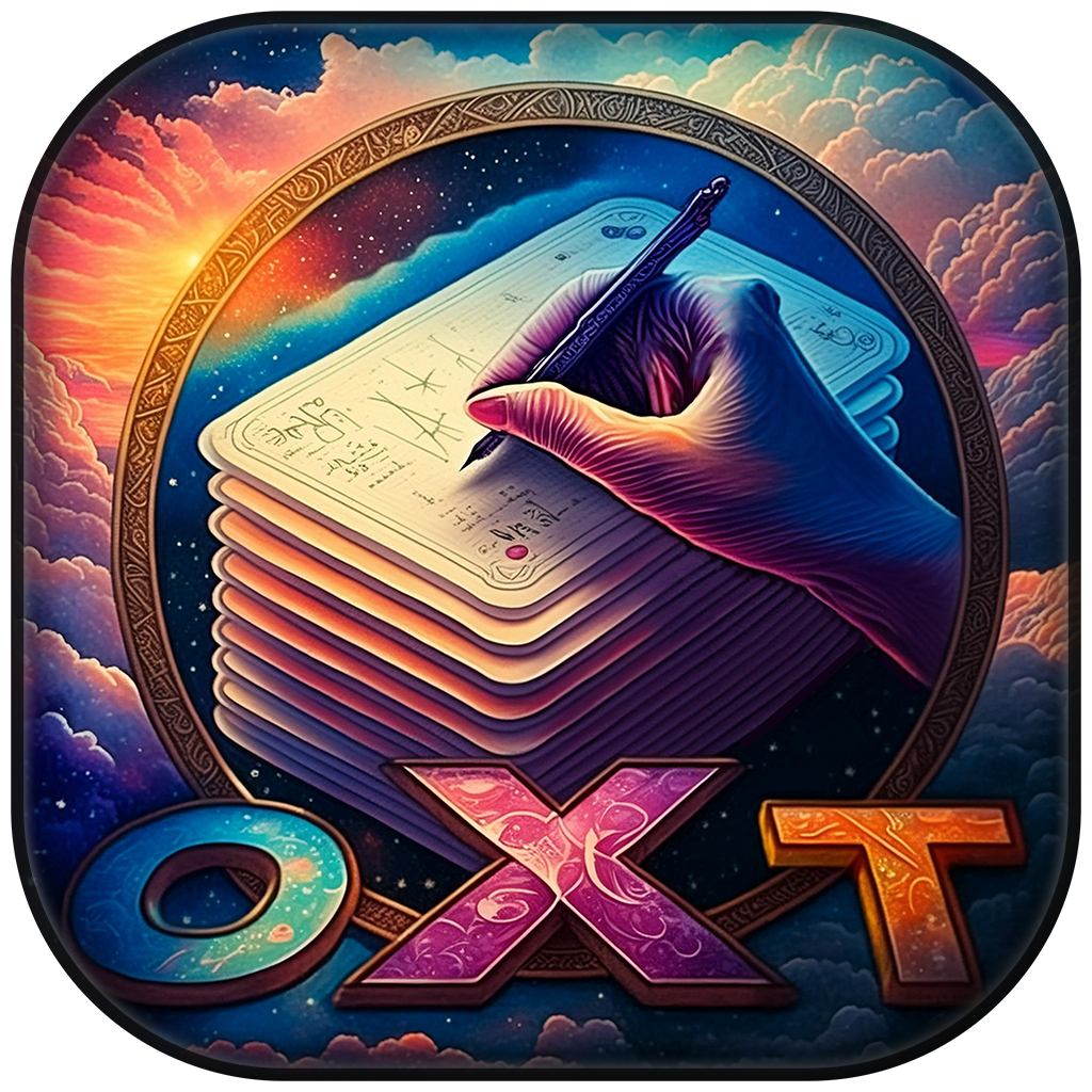
- RetroIcon.png (1.77 MiB) Viewed 794 times
Re: NEW ART / LOGO
Posted: Wed Apr 17, 2024 6:09 am
by tperry2x
I like them both. Very much an improvement, could the lettering stand out more as when the icon is viewed at say 64x64 px, the oxt lettering isn't as noticeable.
Re: NEW ART / LOGO
Posted: Wed Apr 17, 2024 8:06 am
by richmond62
Those are both highly artistic (and I really like the second one), but:
-
- Screenshot 2024-04-17 at 11.07.34.png (14.99 KiB) Viewed 786 times
-
I have no idea whatsoever those are.

Sorry to be a damp squib, but that 3rd icon (which is in a race to the bottom for artistry) is at least distinguishable.
Here's a fairly crappy offering I just dreamt up (and as it is crappy it should only be used here for demonstration purposes) that shows up at that teeny-weeny size as an OXT standalone:
-
- Screenshot 2024-04-17 at 11.21.41.png (78.89 KiB) Viewed 785 times
Re: NEW ART / LOGO
Posted: Wed Apr 17, 2024 8:28 am
by richmond62
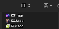
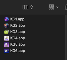
In the Mac dock things are a bit murky as well:
-
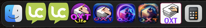
- Screenshot 2024-04-17 at 11.26.57.png (89.23 KiB) Viewed 783 times
-
Someone who has a touch of Daltonism is going to be really stuck.
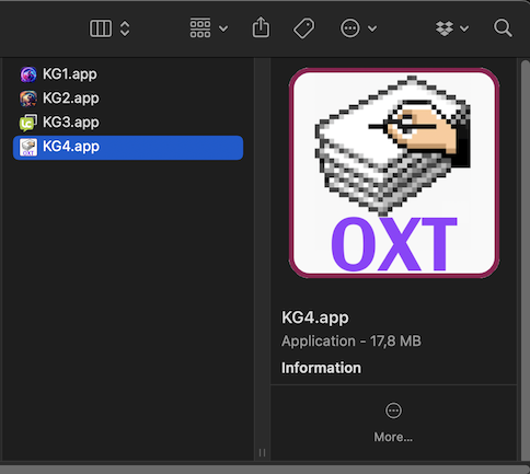
On the humorous side (please do not take offence): that's a slightly odd-shaped thumbnail:
-
- Screenshot 2024-04-17 at 11.29.23.png (72.04 KiB) Viewed 783 times
Re: NEW ART / LOGO
Posted: Wed Apr 17, 2024 11:31 am
by OpenXTalkPaul
The AI sometimes hallucinates things too, extra fingers, fins/gills, and all sorts of other oddities.
These were generated as 2048x2048 (the largest icon size used by Apple at HiDPI 144ppi), they aren't going to look very readable at 32x32px or 16x16px (smallest icon size) without a lot of help from a human. Most every icon has that problem when you reduce it down that small (1990s icon sizes), the anti-aliasing alone turns letters into blobs. So keeping design simplistic (like LC logo) can really help there. If you really want to support all possible icon formats you have to also make 256 color and 1-bit icons at those smaller sizes (which can be a nightmare to try to do).
I will do some tweaking to the letters at the smaller sizes to try to maintain readability. But I don't want to spend a too much time redesigning logo.
Re: NEW ART / LOGO
Posted: Wed Apr 17, 2024 1:35 pm
by richmond62
The AI sometimes hallucinates things too, extra fingers, fins/gills, and all sorts of other oddities.
-
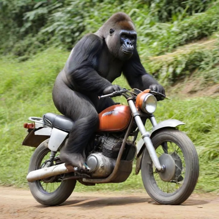
- Gorilla_riding_motorbike.jpg (203.89 KiB) Viewed 776 times
-
This poor fellow is going to end up in trouble because he is NOT holding onto the handlebars, and something very odd indeed is going on with his right foot.

And knowing that that is the standard of A.I. image generation at the moment I would avoid it like the plague (except when getting it to knock together very silly things like the one posted here).
Re: NEW ART / LOGO
Posted: Wed Apr 17, 2024 2:08 pm
by richmond62
Most every icon has that problem when you reduce it down that small (1990s icon sizes), the anti-aliasing alone turns letters into blobs.
Knowing that, while it might be very jazzy to have logos like the ones you have had a robot generate as mast-heads for an OXT webpage, it might be better to confine yourself to "rude-and-crude" offerings for icons.
-

- Screenshot 2024-04-17 at 17.03.27.png (141.17 KiB) Viewed 773 times
-
That's a 'quickie' of my Mac Dock (very similar to the lower panel on any Debian and/or Debian-derivative Linux distros I run), and, as you can see the OXT and the OXTL are, by far the most polychromic icons; a fact that I believe detracts from them.
Re: NEW ART / LOGO
Posted: Wed Apr 17, 2024 2:37 pm
by richmond62
Rude-and-crude:
-
- IKON.png (229.56 KiB) Viewed 772 times
-
- IQON.png (114.54 KiB) Viewed 772 times
-
You may not like them (face it: they are as boring as hell), but . . .
-
Re: NEW ART / LOGO
Posted: Wed Apr 17, 2024 2:42 pm
by richmond62
You have half a chance of working out what they are when the icons are very small:
-
- Screenshot 2024-04-17 at 17.39.27.png (22.65 KiB) Viewed 772 times
-

- Screenshot 2024-04-17 at 17.40.33.png (72.41 KiB) Viewed 772 times
Re: NEW ART / LOGO
Posted: Wed Apr 17, 2024 9:30 pm
by tperry2x
We need a trade off between fancy-looking but illegible, and damn ugly.
(Which is what we already have with the existing icons in my opinion). This generative AI art would be better suited to a splash screen, not an icon I think.
This is why my OXT lite icons are 'flat' with minimal shading:

- tiny panel.png (6.08 KiB) Viewed 746 times
- desktop.png (31.94 KiB) Viewed 746 times
Whereas the splash icon has more shading and effects applied in comparison:
- splash.png (129.47 KiB) Viewed 746 times
All of this is probably subjective and comes down to people's personal preference.
Re: NEW ART / LOGO
Posted: Thu Apr 18, 2024 2:06 am
by OpenXTalkPaul
tperry2x wrote: ↑Wed Apr 17, 2024 9:30 pm
We need a trade off between fancy-looking but illegible, and damn ugly.
(Which is what we already have with the existing icons in my opinion). This generative AI art would be better suited to a splash screen, not an icon I think.
This is why my OXT lite icons are 'flat' with minimal shading:
tiny panel.png
desktop.png
Whereas the splash icon has more shading and effects applied in comparison:
splash.png
All of this is probably subjective and comes down to people's personal preference.
I may do a bit more work in this direction. I do want to refresh the art/splash screen a bit.
I can use these as source materials, mix/match bits and pieces of different versions, and tweak appearance to maintain better readability as I reduce size. I made a version down to 16x16 px and was able to ensure I could still read the letters (but the rest of the art was a bit muddied). SVG Vector versions that are more 'Flat' (and uses correct specified color table) could also be made from these. I could also use parts of the flat vector icons that I worked on for helloSystem.
Other options I have played around with are one-color more graphical versions of OXT logos, going more towards the style of 'LC' speech bubble. Having recently research some
very old unix keyboards that used to have the now defunct special modifier key called the 'Hyper' key, I like the idea of using the symbol for this key, which looks like a diamond or a 4-point star, as an element in the logo.
I have seen icons designed so that they significantly changed style as the icon goes down to the super-small 16px size. So your 1024 px icon could look photographic while the 16px icon would be just a background shape with the OXT letters.
Re: NEW ART / LOGO
Posted: Thu Apr 18, 2024 7:47 am
by OpenXTalkPaul
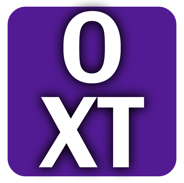
Here's some older OXT logo designs I just dusted off.
I do like that idea that stacking the O over the X almost makes a stick figure:

- OXTsimple3.png (92.02 KiB) Viewed 726 times

- OXTsimple2.png (68.77 KiB) Viewed 726 times

- OXTsimple.png (45.57 KiB) Viewed 726 times
Re: NEW ART / LOGO
Posted: Thu Apr 18, 2024 10:57 am
by richmond62
My criticism of your icons is that as the lettering and the borders are BOTH white, at small scales that may prove problematic:
-
- SShot 2024-04-18 at 13.56.42.png (10.41 KiB) Viewed 720 times
-
- OXTbasic.png (94.53 KiB) Viewed 719 times
Re: NEW ART / LOGO
Posted: Thu Apr 18, 2024 1:53 pm
by OpenXTalkPaul
? The design you posted has a white border too?
At sizes as small as 16x16 a white border is a waste of precious limited pixels.
Furthermore to maintain any sort of recognizability you
HAVE to take some artistic license at those sizes, even more so to limit design to a 16-color table or 1-bit B&W. It makes me have tremendous respect for the design sense of CAROL KAEHLER (early Mac / HyperCard pixel artist)

- OXTsimple3-16px.png (2.37 KiB) Viewed 716 times

- OXTsimple3-32px.png (1.68 KiB) Viewed 716 times

- OXTsimple3-64px.png (6.98 KiB) Viewed 716 times

- OXTsimple3-128px.png (15.18 KiB) Viewed 716 times
Re: NEW ART / LOGO
Posted: Thu Apr 18, 2024 2:38 pm
by richmond62
the design sense of CAROL KAEHLER
SUSAN KARE
https://en.wikipedia.org/wiki/Susan_Kare
CAROL KAEHLER wrote a book about HyperCard.
? The design you posted has a white border too?
Yes, it does, but the border and the letters aren't overlapping each other.
Re: NEW ART / LOGO
Posted: Thu Apr 18, 2024 2:57 pm
by richmond62
No border and about as derivative as it could be:
-

- OXTz.png (172.06 KiB) Viewed 709 times
-
- SShot 2024-04-18 at 17.59.34.png (56.75 KiB) Viewed 709 times
Re: NEW ART / LOGO
Posted: Thu Apr 18, 2024 3:42 pm
by OpenXTalkPaul
Oh wow, right, that's who I meant, my bad...
Did KAEHLER Documentation for Apple or something like that?
The overlapping of the letters with no break between them was about trying to do something more interesting than three capital letters of equal size arranged symmetrically.
For the modern icon sizes (up to 1024x1024) we have lots of pixels to work with.
The16x16px version doesn't have to mirror the larger sizes.
I don't find it all that much more readable @ 16x16px size

- Untitled.png (24.19 KiB) Viewed 706 times
Re: NEW ART / LOGO
Posted: Thu Apr 18, 2024 3:56 pm
by OpenXTalkPaul
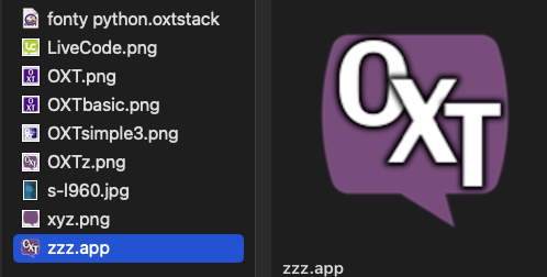
Looks a bit boring sitting in my doc with the others

- Untitled 2.png (28.72 KiB) Viewed 702 times